
Slenderness and Structural Honesty in Steel Bridge Design
How slenderness ratios shape visual lightness and perceived elegance
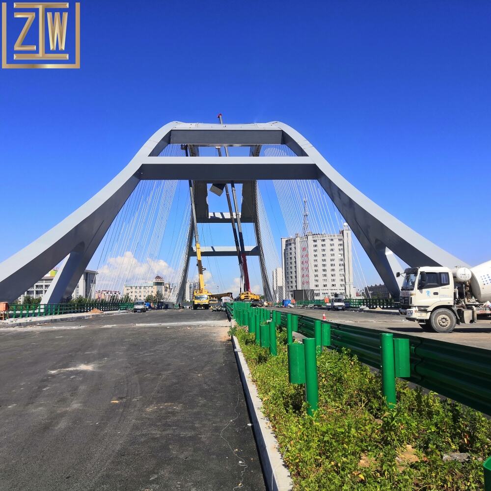
The slenderness ratio of a steel bridge basically tells us how long it spans compared to how deep it is structurally. When these ratios get higher, bridges look lighter and more elegant because they take up less space visually while still spanning large distances. This ties into what engineers call structural honesty, where we can actually see how forces move through the structure instead of hiding them away. With today's stronger steel materials, ratios over 25:1 are becoming possible, giving bridges a graceful appearance without sacrificing strength. According to a recent survey from 2023, around three quarters of people thought bridges with ratios above 20:1 looked much more elegant than their bulkier counterparts. And there's another benefit too: using these slender designs cuts down on materials needed by roughly 30% compared to traditional methods. That means form really does follow function when it comes to modern steel bridges. The spaces between support columns create interesting patterns that change depending on where someone stands and what time of day it is, adding another layer of visual interest to these structures.
Case study: Øresund Bridge – harmonizing span-to-depth ratio, aerodynamics, and iconic presence
Looking at the Øresund Bridge, what stands out is how slender it appears despite spanning nearly half a kilometer. The bridge has a remarkable 15:1 ratio between its length and depth in the steel section that crosses over water. Designers worked hard to get this right, finding a sweet spot where strength meets elegance so the structure looks good while still holding up against all sorts of forces. Wind resistance was another big concern for engineers building in such an open coastal area. They solved this problem by shaping the bridge's core with a tapered design that cuts down on air drag by about 40% compared to regular bridges. What we see as beautiful lines actually serve practical purposes too, making the whole thing work better both functionally and visually.
- The shallow deck appears to float above water during daylight
- Night illumination emphasizes continuous lines rather than mass
- Weathering steel patina creates harmonious color transitions with the seascape
Since its 2000 opening, the structure has become a Scandinavian cultural symbol, demonstrating how disciplined ratio optimization transforms infrastructure into landmarks. Its slender profile required 22% less steel than initial proposals—proof that elegance and efficiency coexist in exemplary steel bridge design.
Proportional Harmony and Symmetry in Steel Bridge Geometry
Psychological impact of cross-section proportions on human perception of stability and grace
How we see steel bridges has a lot to do with their cross section proportions. When engineers get the balance right between visual weight and actual structure, something clicks in our brains. Most people find bridges with a depth to span ratio around 1:20 to 1:30 look stable and elegant. Studies back this up too - about 80% of folks think those slender deck designs are graceful, even if thicker versions can hold just as much weight. On the flip side, anything over 1:15 tends to make us feel uneasy without knowing why exactly. The same principle applies to how girders are spaced apart. Closer together looks precise and orderly, but leave them too far apart and suddenly the bridge seems vulnerable somehow. Many famous bridges actually follow what's called the Golden Ratio (around 1:1.618), where the relationship between different parts feels both mathematically sound and naturally beautiful. These dimension choices turn cold steel into something poetic, proving that good engineering doesn't have to sacrifice beauty when it works with how our minds process shapes and sizes.
When asymmetry enhances site integration: intentional imbalance in modern steel bridge design
Designers these days are turning to intentional asymmetry when faced with tricky situations where rigid symmetry just doesn't work with the landscape or city layout. According to a recent industry report from last year, about six out of ten new bridges over rivers have some kind of imbalance built into their design. We see this in things like bridge arms that stretch longer on one side to save old growth trees along the banks or create space for potential flooding areas. These thoughtful design choices actually solve multiple problems at once for each particular location.
- Terrain adaptation: Angled piers follow natural contours where uniform spacing would require costly excavation
- Urban integration: Varying arch heights frame landmark views while accommodating underground utilities
- Visual dynamism: Offset cable arrangements create kinetic tension against static landscapes
By rejecting rigid symmetry, engineers achieve deeper environmental synchrony—proving imbalance can be the ultimate expression of harmony when responding to unique site narratives.
Sculptural Detailing at Human Scale: Haunches, Parapets, and Material Continuity
Haunched girders as expressive load-path articulation—merging function and rhythm
Haunches on girders turn what's needed for strength into something visually striking as they get thicker near the supports, basically showing where the most stress happens in the structure. The gradual narrowing makes interesting patterns along the side of steel bridges while also making them better at handling weight. Most engineers aim for depth to span ratios somewhere between 1 to 15 and 1 to 30 when designing these structures, finding a sweet spot between looking slender and staying strong enough. Using variable depth instead of uniform sections can cut down on steel usage by roughly 12 to maybe even 18 percent. What's really cool is how the curved shape draws eyes naturally to where the bridge connects to its foundations and seems to move with the traffic passing over it, turning engineering forces into something people actually notice and appreciate architecturally.
Parapet design: balancing safety compliance, tactile materiality, and visual boundary definition
The parapet does more than just keep people safe on bridges—it actually frames how we see the whole structure visually, depending on what materials get used and how they're shaped. Nowadays, many new designs incorporate those perforated steel panels with about half their surface area open. This setup passes all the necessary impact tests but also cuts down wind pressure by around a quarter compared to solid walls. When it comes to touch, there's real difference too. Brushed stainless steel doesn't reflect light so much and stays cleaner longer since fingerprints don't stick as badly. Textured surfaces are another story entirely—they prevent slips when wet. What makes these design choices interesting is how they blend built environments with surrounding landscapes. Curves along the edge can make harsh lines feel softer, while slender horizontal bars give the illusion of longer spans without weakening the overall structure.
Temporal Aesthetics: Light, Weathering, and the Evolving Identity of Steel Bridges
Steel bridges become something more than just structures when they interact with their environment over time. During different parts of the day, sunlight bounces off these metal frameworks creating ever-changing reflections and dramatic shadows that seem to reshape how we see the actual structure itself. The special type of weathered steel used on many modern bridges forms a protective layer that starts out as warm brown tones, then turns reddish orange before settling down to more muted earth colors. This rust-like coating actually helps protect against corrosion while making the bridge blend better with nature around it. As years go by, this natural aging process turns the surface into almost like a record book showing all the weather conditions it has endured through gradual color changes. With each season comes new visual effects too. Winter frost tends to emphasize the outlines of beams and supports, whereas bright summer days make those same surfaces gleam with intense metallic shine. What was once purely functional infrastructure now becomes part of the landscape, constantly changing appearance as materials meet atmosphere in ongoing artistic transformation.
FAQ Section
What is a slenderness ratio in steel bridge design?
The slenderness ratio in steel bridge design refers to the relationship between the span length and the depth of the structure. It assesses how a bridge looks visually while maintaining structural integrity.
Why are slender bridge designs preferred?
Slender bridge designs are preferred because they offer visual elegance, require fewer materials, save costs, and enhance structural honesty by showcasing how forces move through the structure.
How does asymmetry impact modern bridge design?
Asymmetry in modern bridge design solves multiple engineering challenges by adapting to natural terrain, integrating with urban landscapes, and creating visual dynamism that matches the environment.